
The 7 types of logos (with examples) and how to choose
The seven categories are a useful teaching framework, not a technical standard or a ranking of design quality. Categories overlap, and using a reusable symbol does not give a business exclusive rights to that shape. A combination mark pairs a name with a symbol in an approved arrangement. Using either part separately requires its own tested variant; this flexibility is not automatic.
On this page
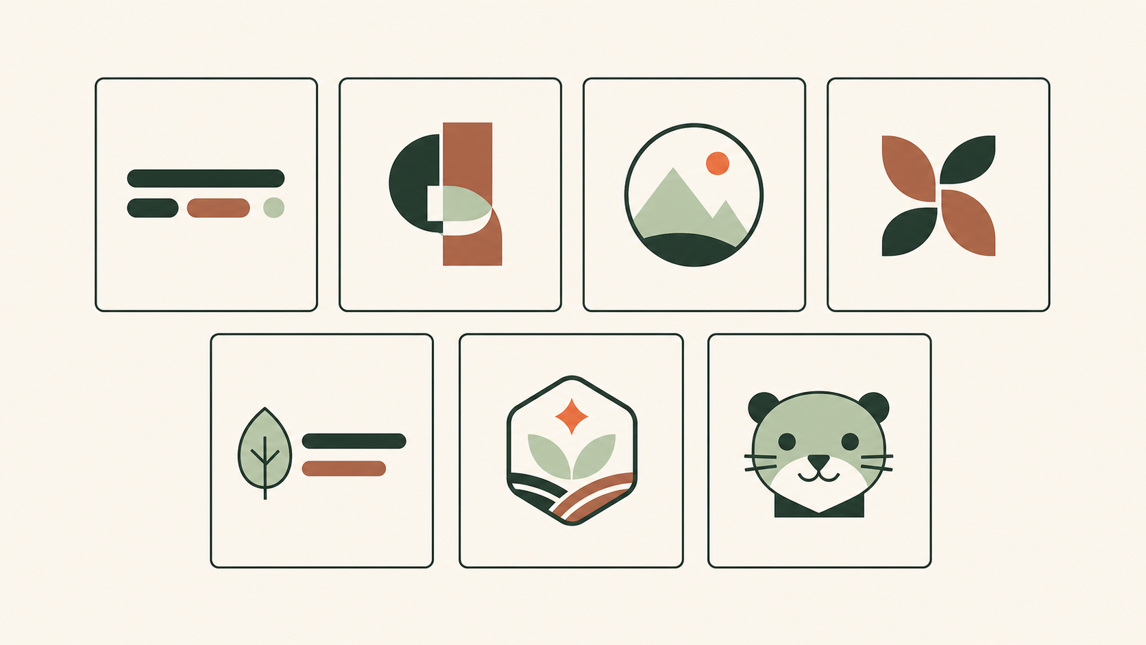
Every logo falls into one of a few families, and the difference is simple: does it use words, a symbol, or both — and is it enclosed in a shape? Get the family right and the rest of the design gets easier, because each type has a job it does well and a place it tends to struggle.
How many types of logos are there?
The seven categories are a useful teaching framework, not a technical standard or a ranking of design quality. Categories overlap, and using a reusable symbol does not give a business exclusive rights to that shape.
1. Wordmark (logotype)
A wordmark uses the full brand name as a consistent typographic identity, without a separate symbol. Typeface, spacing and proportions do the work; custom lettering is optional, and an existing typeface can also be used.
- Best when: the name is short, distinctive, and worth reinforcing (think Google, Coca-Cola, FedEx, Visa).
- Watch out for: legibility at very small sizes, and names long enough to become a cramped block.
- Pro tip: because a wordmark has no compact icon, you often still need a small companion mark for favicons and app tiles.
2. Lettermark (monogram)
A lettermark uses initials or a monogram as the identifying mark. It may use an existing typeface or custom lettering. Approve the spacing and proportions; it does not have to be drawn by hand.
- Best when: the full name is long or formal (IBM, HBO, NASA, CNN).
- Watch out for: recognition — unfamiliar initials take repeated exposure before people connect them to the organization.
- Pro tip: treat the initials as a designed mark; kerning and proportion do the work.
3. Pictorial mark (symbol)
A pictorial mark is a recognizable icon based on a real object — an image that stands for the brand without the name beside it.
- Best when: you want cross-language recognition and a compact icon (Apple, Target, Shell, Twitter's bird).
- Watch out for: a new symbol carries no meaning on its own yet, so it usually needs to travel with the name first.
- Pro tip: pick something ownable and simple; a literal illustration of what you sell dates quickly.
4. Abstract mark
An abstract mark uses an invented geometric form rather than a literal object, letting it suggest a quality — motion, connection, precision — without tying the brand to one product.
- Best when: you want a unique, ownable shape and are not a literal-product business (Nike's swoosh, Pepsi, Chase, Adidas' trefoil).
- Watch out for: an abstract shape has no automatic meaning, so it needs a clear concept and consistent use to become memorable.
5. Mascot
A mascot logo is an illustrated character that becomes the face and voice of the brand.
- Best when: you communicate often with a community or family audience and want warmth and personality (KFC's Colonel, Michelin's Bibendum, Mailchimp's Freddie).
- Watch out for: mascots need a full set of rules — poses, expressions, cropping, and simplified versions — and can feel dated if not maintained.
- Pro tip: design a simplified, single-color version from day one for small placements.
6. Combination mark
A combination mark pairs a name with a symbol in an approved arrangement. Using either part separately requires its own tested variant; this flexibility is not automatic.
7. Emblem
An emblem encloses the name and imagery inside a badge, seal, shield, or crest — the oldest logo form.
- Best when: a contained, crafted, or official feel suits the brand, and it lives on packaging, uniforms, or signage (Starbucks (1971), Harley-Davidson, BMW, the NFL).
- Watch out for: fine detail is the main risk — an emblem that looks rich large can collapse when reduced, embroidered, or shown as a favicon.
- Pro tip: plan a simplified variant for small sizes from the start.
The seven types at a glance
| Type | Uses | Best when… | Real examples |
|---|---|---|---|
| Wordmark | name only | the name is short and distinctive | Google, Coca-Cola, FedEx |
| Lettermark | initials only | the full name is long | IBM, HBO, NASA |
| Pictorial mark | symbol only | you want cross-language recognition | Apple, Target, Shell |
| Abstract mark | symbol only | you want an ownable, flexible shape | Nike, Pepsi, Chase |
| Mascot | character | a friendly, expressive voice fits | KFC, Michelin, Mailchimp |
| Combination | name + symbol | you need a name and symbol; separate variants need approval and testing | Adidas, Burger King, Lacoste |
| Emblem | name in a shape | a contained, crafted feel suits | Starbucks (1971), Harley-Davidson |
Which type of logo is right for you?
Work through it in order:
- Is your name short and distinctive? A wordmark can carry it. If the name is long or formal, a lettermark gives it a compact signature.
- Do you need a compact icon for app tiles, avatars or favicons? Compare a name-and-symbol combination with a wordmark. Use the symbol separately only as an approved variant that passes the actual-size test; the combination itself does not guarantee this option.
- Could the symbol stand alone later? Test whether it stays distinctive and recognizable without the name. A pictorial or abstract shape does not guarantee this; initially, showing it beside the name may help people learn the association.
- Is character central to your brand voice? A mascot builds warmth — at the cost of more rules to maintain.
- Do you want a contained, official feel for packaging or signage? An emblem delivers it — just design a simplified version for small sizes.
The seven categories are a useful teaching framework, not a technical standard or a ranking of design quality. Categories overlap, and using a reusable symbol does not give a business exclusive rights to that shape.
The short answer
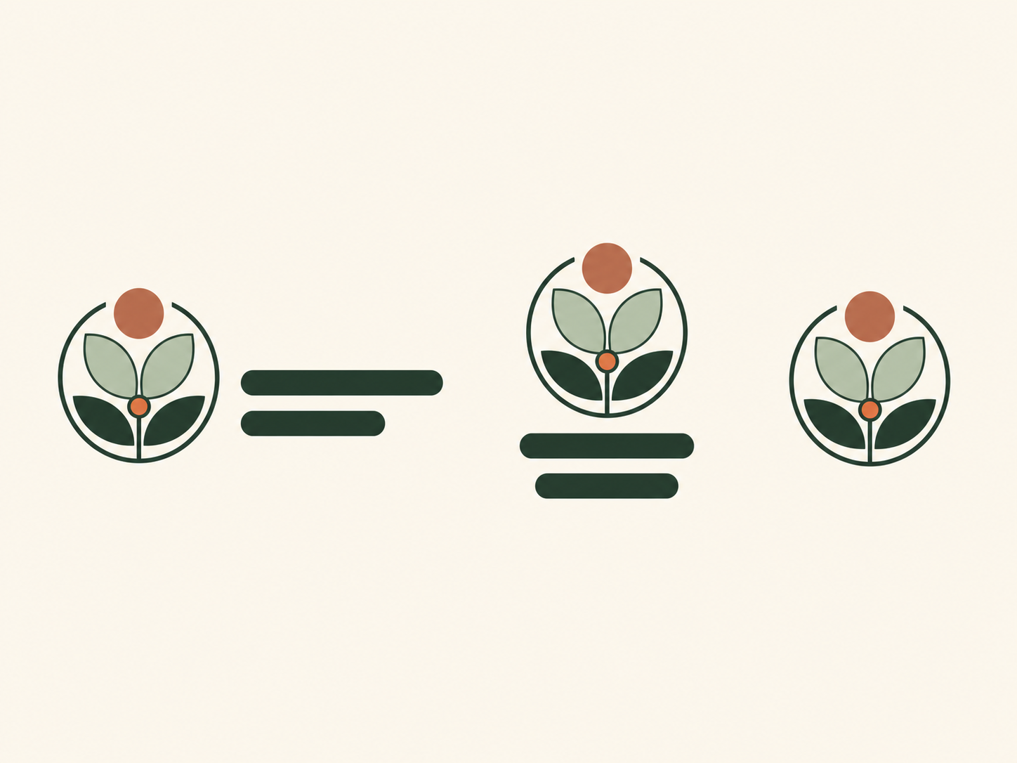
A combination mark pairs a name with a symbol in an approved arrangement. Using either part separately requires its own tested variant; this flexibility is not automatic.
the parts of a logo · make yours step by step
Three situations that change the choice
For a new bakery with a short name, compare a wordmark with a combination mark on a bag and a shop sign. For an unfamiliar consultancy with a long name, test whether initials actually help the reader identify it; a compact full-name lockup may communicate more. For a community sports club, an emblem or mascot can carry personality, but it also needs a simplified avatar.
These are starting hypotheses, not rules for an entire industry. Choose two candidates and place them in the same actual-size contexts before deciding. A symbol is not automatically distinctive because it is abstract, and a name-plus-symbol layout does not have to separate into two independently useful marks. Approve only the combinations you have tested.
Related practical guides: Logo testing checklist: 10 checks before you launch
Try a few logo types on your name — it's freeFrequently asked questions
How many types of logos are there?
The seven categories are a useful teaching framework, not a technical standard or a ranking of design quality. Categories overlap, and using a reusable symbol does not give a business exclusive rights to that shape.
Does the type of logo determine its quality?
The seven categories are a useful teaching framework, not a technical standard or a ranking of design quality. Categories overlap, and using a reusable symbol does not give a business exclusive rights to that shape.
Which type of logo is best for a small business?
For a short, distinctive name, start by comparing a wordmark and a name-plus-symbol design. If you need a compact avatar, test an approved symbol or monogram at its actual size. For a long unfamiliar name, compare a compact full-name layout before choosing initials. Decide on a real bag, sign and phone header; no type is universally best.
What is the difference between a wordmark and a lettermark?
A wordmark sets the full brand name (Google, Coca-Cola). A lettermark compresses a longer name into initials or a monogram (IBM, HBO). Use a lettermark when the full name is long or hard to fit.
Sources
- Types of logos and how to choose — Adobe
- The Evolution of Our Logo — Starbucks