
The anatomy of a logo: every part explained
A logo is assembled from a small set of named pieces — the mark, the wordmark, an optional tagline — and governed by a few rules: the clear space around it, its minimum size, and the lockups that define how the pieces are arranged. Not every logo uses all of them (a wordmark-only logo has no separate symbol), but the vocabulary is the same, and it is what a brand's guidelines are built from.
On this page

What are the parts of a logo?
A logo is assembled from a small set of named pieces — the mark, the wordmark, an optional tagline — and governed by a few rules: the clear space around it, its minimum size, and the lockups that define how the pieces are arranged. Not every logo uses all of them (a wordmark-only logo has no separate symbol), but the vocabulary is the same, and it is what a brand's guidelines are built from.
The mark (symbol or icon)
The mark is the symbolic part of a logo — the icon that can often stand alone once a brand is known. It is what appears as an app icon or a favicon when there is no room for the full name. Deciding whether you even need a separate symbol is a question of logo type; see the seven types of logos.
The wordmark (logotype)
The wordmark, or logotype, is the brand name in a specific, consistent typographic treatment. Its typeface, spacing (tracking and kerning), proportions and optional custom letter details carry the identity. It can use an existing typeface or custom lettering; hand drawing and modified characters are not requirements. Approve a fixed version and reuse it consistently.
The tagline
A tagline is a short phrase locked to the logo in some layouts. It is optional, and because it is usually dropped at small sizes, a logo must always work without it.
Clear space (the exclusion zone)
Clear space is the minimum empty margin kept around the logo so nothing crowds it — other elements, page edges, or busy backgrounds. Rather than a fixed number of pixels, it is almost always defined relative to the logo itself: for example, "keep a margin equal to the height of the mark," or "the width of the capital letter." Tying it to the logo means the clear space scales automatically whenever the logo is resized.
Minimum size
The minimum size is the smallest tested size at which a particular variant remains clear. Set it separately for each approved lockup. Below that limit, use another tested variant only if it fits its own minimum; otherwise enlarge the placement or change the layout.
Lockups: primary, secondary, and mark-only
A lockup is an approved arrangement of the parts. Most systems define a few:
- Primary — the default, often the symbol beside the name (horizontal).
- Secondary — an alternate, such as the symbol stacked above the name, for tighter or square spaces.
- Mark-only — the symbol on its own, for favicons, app icons, and small avatars.
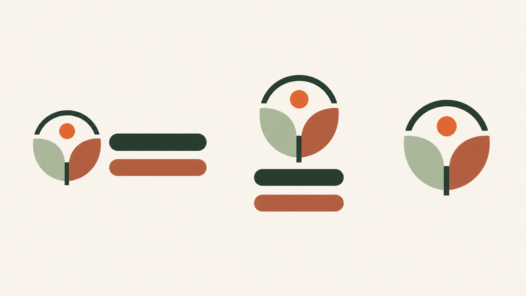
A responsive logo uses approved variants for different spaces: for example, a full lockup, a compact wordmark or a simplified symbol. These are possible options, not a required sequence, and separating a symbol must be approved and tested. Each variant has its own minimum size. If none remains clear in the available space, enlarge the placement or change the layout rather than shrinking it further.
Why the anatomy matters
Naming these parts is what turns a logo from a single image into a usable system. It is the difference between "here is our logo" and "here is how our logo behaves in a wide header, a square avatar, and a tiny tab." When you are ready to build one, here is how to make a logo, step by step.
How to turn the parts into usable rules
For the fictional bakery Mira, begin with a horizontal name-and-symbol lockup, a stacked version for a square label, and the symbol alone for a tiny icon. Keep the same proportions and spacing relationships in the approved files; do not let each supplier rearrange the parts.
Measure clear space with a repeatable unit, such as one quarter of the symbol's width. This is an example rule to test, not an industry minimum. Print the label at its actual size and inspect the website header on a phone. Record a separate minimum size for each lockup. If the tagline becomes unreadable, switch to the approved version without it rather than enlarging only the tagline. Store those decisions with the files so the next person can apply them consistently.
Related practical guides: Logo testing checklist: 10 checks before you launch
Design your logo — it's freeFrequently asked questions
What is clear space in a logo?
Clear space (or exclusion zone) is the minimum empty margin kept around a logo so nothing crowds it. It is usually defined by a measurement taken from the logo itself — often the height of a letter or the mark — so it scales with the logo.
What is a logo lockup?
A lockup is a fixed, approved arrangement of a logo's parts — for example the symbol beside the name, or stacked above it. Defining a few lockups keeps the logo consistent instead of rearranged at random.
What is the minimum size of a logo?
The minimum size is the smallest tested size at which a particular variant remains clear. Set it separately for each approved lockup. Below that limit, use another tested variant only if it fits its own minimum; otherwise enlarge the placement or change the layout.
Does a logo need a tagline?
No. A tagline is optional and is usually dropped at small sizes, so a logo must always work without it.