
Logo testing checklist: 10 checks before you launch
A logo is ready when it works in the places your business actually uses, not when it looks impressive on a large mockup. Run these ten checks on the same candidate, keep evidence of any failures, and approve only the variants and sizes you have tested.
On this page
- What should you prepare before testing?
- 1. Can a new reader read the correct name?
- 2. Does the intended small version survive reduction?
- 3. Does one solid color preserve the design?
- 4. Does each background have a readable variant?
- 5. Does spacing protect the logo from its surroundings?
- 6. Do crops and alternate layouts stay consistent?
- 7. Does the actual material reproduce it reliably?
- 8. Is it sufficiently different in its real market?
- 9. Do the exported files work at their destination?
- 10. Can another person use the correct version?
- What counts as ready to launch?
What should you prepare before testing?
Write down the exact brand name, the main audience and the first three applications: perhaps a website header, social profile and printed label. List the versions each needs. Save a dated candidate so that one repair does not quietly invalidate another result. Use actual files at actual dimensions; a mockup can hide thin lines, blur or awkward spacing.
Make a simple record with four columns: check, evidence, correction and decision. The dimensions below are test examples, not universal standards. If you have not designed the candidate yet, start with the logo creation process.
1. Can a new reader read the correct name?
Failure: the spacing in “Clay Lab” makes it read as “Claylab”, or a decorative initial resembles another letter. Test: show the wordmark at its intended header width to someone who has not seen the brief. Ask them to write what it says before explaining it. Check spelling, accents and any legal wording against the approved name.
Fix: adjust spacing, choose clearer letterforms or remove the conflicting flourish. Pass when the intended name is read correctly in the intended context; hold if mistakes persist. This tests reading, not whether every person likes the font. See choosing a logo font for changes worth comparing.
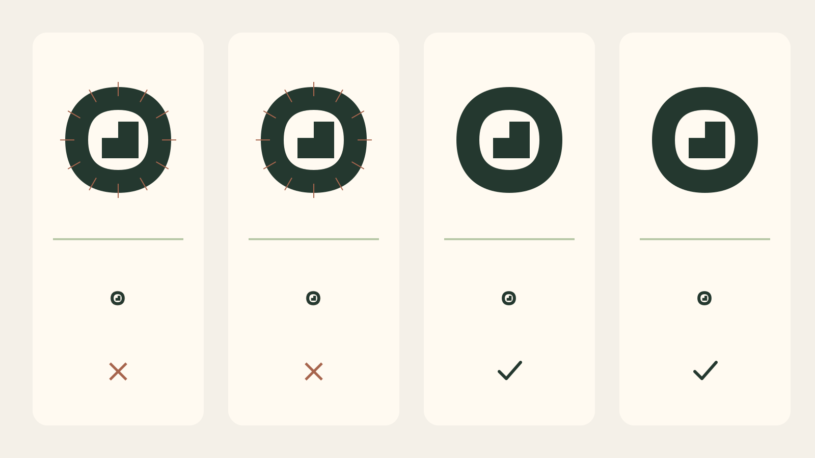
2. Does the intended small version survive reduction?
Failure: a leaf's internal veins merge into a dark patch in an avatar. Test: display the symbol at the actual slot size, without zooming. For a favicon, compare example previews at 16 and 32 pixels; for a full wordmark, test the width your header provides. Look for closed counters and disappearing strokes.
Fix: remove small details, widen gaps or use an approved symbol-only variant. Pass at the documented minimum for that variant; hold any placement below it. Do not shrink a tagline until it becomes illegible just to claim one file works everywhere.
3. Does one solid color preserve the design?
Failure: two overlapping shapes are distinguishable only because one is blue and one green. Test: create a deliberate all-black version on white and all-white version on black. Use one solid color, not a grayscale filter. Check whether the silhouette and important internal spaces remain meaningful.
Fix: separate shapes, add a designed knockout or simplify the overlap. Pass when the one-color variant keeps the important structure; hold one-ink printing until it does. A multicolor logo is valid, but a colored preview is no substitute for the file a stamp or engraver needs.
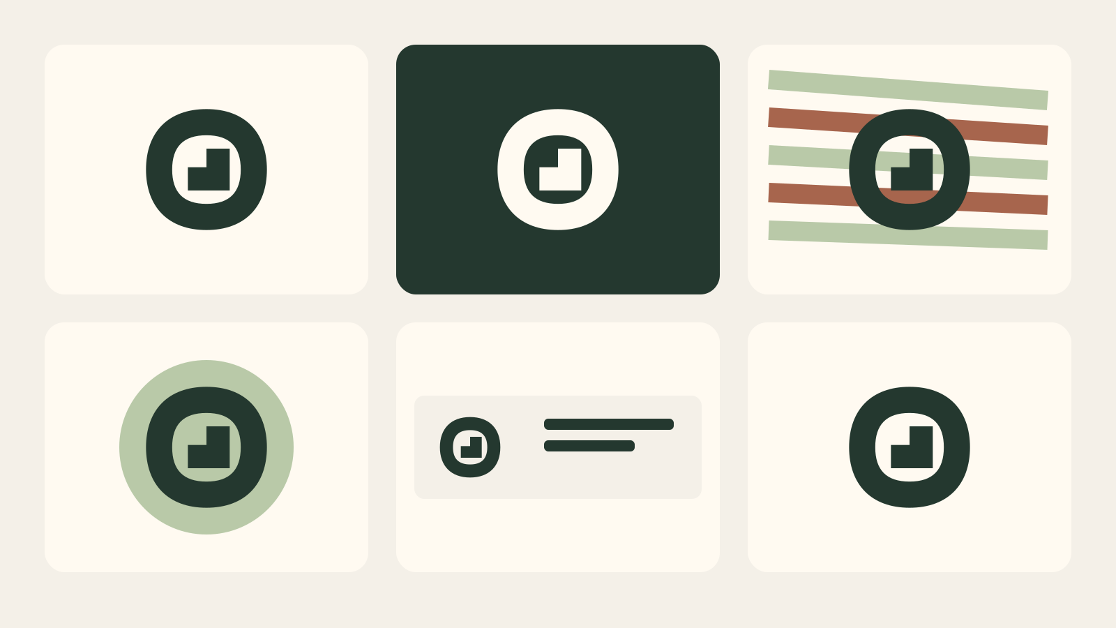
4. Does each background have a readable variant?
Failure: a pale symbol disappears on a light page, while a transparent export inherits a busy photograph. Test: place the actual logo on your light surface, dark surface and any photo it will really use. Look at the edge and name, not merely whether the palette feels attractive.
Fix: specify a reverse version, a controlled background panel or an alternate placement. Pass only the tested background combinations; hold uncontrolled ones. W3C exempts logotypes from minimum text contrast, but nearby navigation and buttons still have their own requirements. The exemption is not a reason to accept an unreadable mark.
5. Does spacing protect the logo from its surroundings?
Failure: a badge almost touches a price sticker or the name is squeezed against a card edge. Test: place it in the real layout with neighboring text, buttons and borders. Measure the smallest usable buffer using a repeatable unit from the logo, then compare a tighter and a wider arrangement.
Fix: define clear space and move nearby content; adjust symbol-to-name spacing separately if the lockup feels disconnected. Pass when the layout can preserve both rules; hold a placement that cannot. Clear space is a documented design decision, not a magical fixed percentage shared by every logo.
6. Do crops and alternate layouts stay consistent?
Failure: a circular avatar cuts off a mascot's ears, or the stacked version uses a different font. Test: view horizontal, stacked and symbol-only versions side by side, then apply the actual circular and square crops. Verify shared shapes, proportions and name spelling.
Fix: make a crop-safe variant with more space, or change the lockup instead of stretching the artwork. Pass when each needed version reads as the same identity; hold missing or inconsistent versions. A social avatar may use only the symbol while the account name supplies the words. That does not require every full logo to fit a circle.
7. Does the actual material reproduce it reliably?
Failure: a fine line vanishes on a fabric label although it looks perfect on screen. Test: print a proof at the intended physical dimensions, or ask the actual supplier for a process-specific sample. Check ink spread, stitched gaps, reverse details and the normal viewing distance.
Fix: prepare a simpler production variant or enlarge it within the layout. Pass after that process's proof is acceptable; hold the production order if you have only a glossy digital mockup. An office print helps check scale but cannot certify embroidery, engraving or a different printing process.
8. Is it sufficiently different in its real market?
Failure: a bakery adopts the same wheat circle and almost identical lettering as the shop next door. Test: assemble a small board of relevant competitors with names visible and compare overall silhouette, typography and colors. Ask what could be confused without telling viewers which design is yours.
Fix: change the shared structural idea rather than merely switching colors. Pass this visual screening when an obvious confusion has been addressed; hold if a close resemblance needs investigation. This is not legal clearance: the USPTO's guidance on strong marks is a starting point, and applicable trademark checks depend on the market.
9. Do the exported files work at their destination?
Failure: a PNG has an unwanted white rectangle, or a supposedly vector file contains a blurry bitmap. Test: open the final export in a second viewer, inspect transparency and enlarge the SVG. Upload a copy to the intended platform and check its real preview. Compare its name, spacing and colors with the approved candidate.
Fix: re-export in the right format and size, using the file checklist to organize outputs. Pass the tested files; hold broken ones. Google Business Profile accepts JPG or PNG under its own image guidelines; SVG availability does not imply every destination accepts SVG.
10. Can another person use the correct version?
Failure: a colleague publishes an old draft called “final-final2” or cannot locate a font license. Test: hand the package to someone with one ordinary task: place the logo on a dark background. Can they select the right file without asking you? Check the source, licenses, variant names and approved version together.
Fix: remove obsolete files from the delivery package, keep the project archive, and provide a short usage note. Pass when the package and rights records are complete; hold unresolved permissions or missing essential files. Extend your brand guidelines with the tested sizes, backgrounds and production restrictions.
What counts as ready to launch?
Do not average the ten results into a flattering score. A misspelled name is not balanced by nine attractive mockups. Mark each required application approved, approved with a stated restriction, or hold for repair. Keep the evidence and who accepted it. After a correction, repeat the affected tests: widening gaps can improve reduction but alter a reverse version or spacing. Optional applications can remain pending if the live package clearly excludes them.
Create a logo to testFrequently asked questions
Does a logo have to work at 16 pixels?
Only the version intended for a 16-pixel placement. A full name and tagline need not fit a favicon. Test a simplified symbol there and set a separate minimum size for the full logo.
Is a black-and-white logo the same as a grayscale logo?
No. Grayscale preserves different tones; a single-color version uses one ink or one solid color. Test both if your actual applications need them.
How many people should test a logo?
Use a small exploratory group from the intended audience, including people unfamiliar with the name. Their mistakes can reveal problems, but this is not a statistically representative study or a sales forecast.
Must a logo meet WCAG contrast ratios?
Logotypes are exempt from the minimum contrast requirement for text. That exemption does not cover ordinary interface text or buttons. Separately, make the logo readable and provide an appropriate accessible text alternative in its context.
Can these tests confirm that a logo is legally available?
No. Visual comparisons and source records identify issues to investigate; they cannot replace jurisdiction-specific trademark searches or qualified advice when clearance is needed.