
How to choose a font for your logo
Type does most of the work in a logo, especially a wordmark. Choosing a font comes down to four decisions: pick a category that matches your brand's personality, make sure it stays legible at small sizes, limit yourself to one or two typefaces, and pair them with enough contrast to feel deliberate. Save script and decorative fonts for accents, not the whole name. Proof the real name before choosing.
On this page
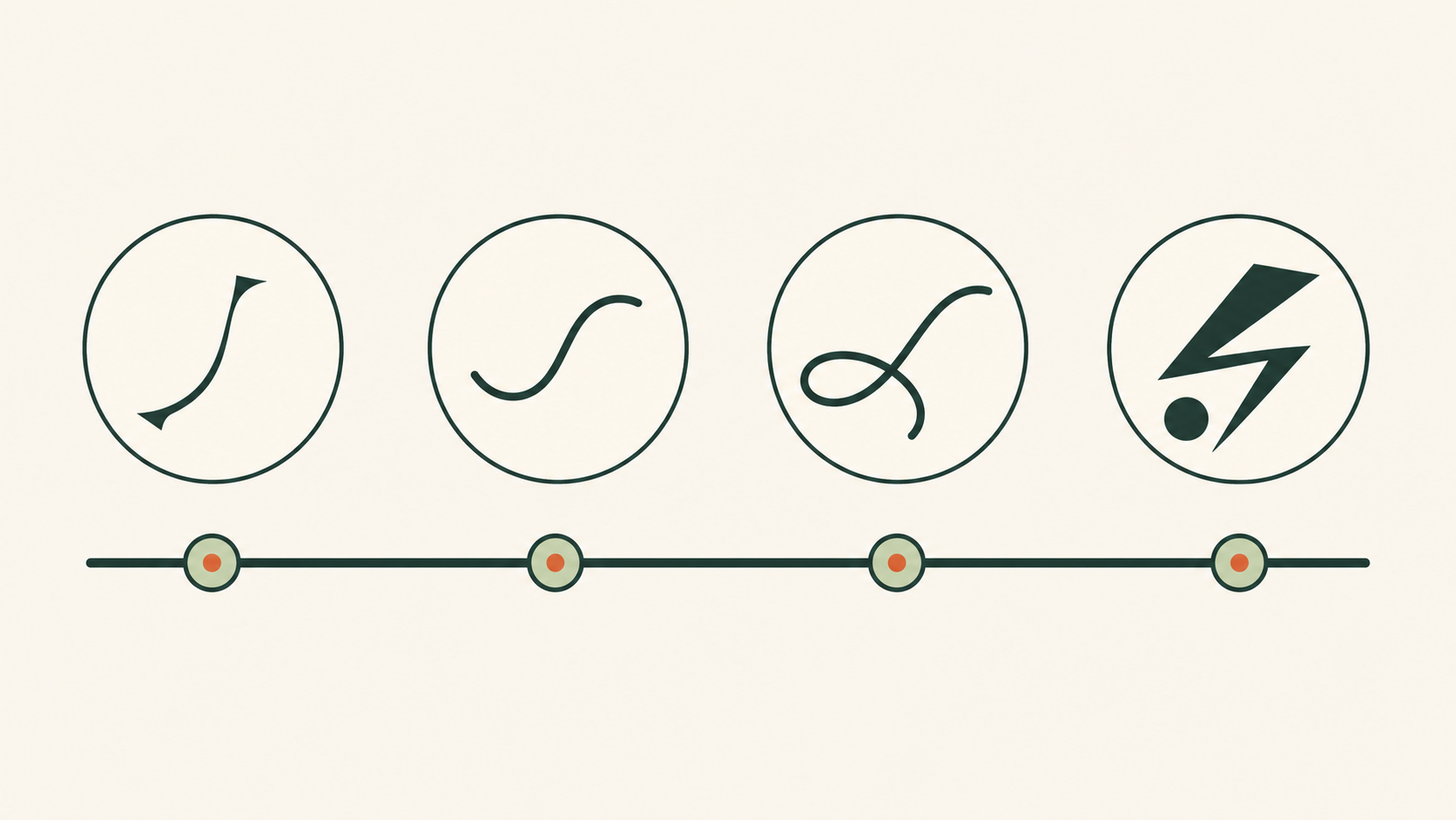
Start with your brand's personality
A font is a voice. Before comparing typefaces, name the personality you want — three or four adjectives such as calm and premium or friendly and energetic — because the letterforms should tell the same story as your brand. The main type categories each lean a certain way:
- Serif — the small strokes at the ends of letters read as traditional, authoritative, and warm. Good for heritage, editorial, and premium brands.
- Sans-serif — clean, unadorned letterforms read as modern, minimal, and clear. They stay crisp at small sizes, which suits digital-first brands.
- Slab serif — chunky, confident serifs that feel sturdy and bold.
- Script — handwritten or calligraphic; personal and elegant, but easily illegible small.
- Display — expressive, characterful faces built for large use, not body text.
Make it legible at small sizes
Legibility is the top priority — a logo that cannot be read is not doing its job. Because a logo lives at favicon size and on phone screens as often as on billboards, check your chosen font small and in low contrast, not just large on your monitor. This is where sans-serifs and simple serifs win, and where delicate scripts and thin display faces fall apart.
Use one or two fonts — no more
The cleanest logos use a single typeface. Two can work when they play clear, contrasting roles — for example a distinctive face for the brand name and a plain one for a tagline or lettermark. The moment you add a third or fourth font, you lose that two-role hierarchy and the logo starts to look unresolved.
Pair fonts with contrast — but make them belong
If you do use two, contrast is what makes the pairing feel deliberate: a serif and a sans-serif are easy to pair because one brings warmth and the other clarity. The catch is that they must still feel like they belong together. Avoid a mood mismatch — a stiff, formal serif next to a goofy rounded sans reads as an accident, not a decision.
Mistakes to avoid
- Too many typefaces. More than two breaks the hierarchy.
- Trend-chasing fonts. A face that is everywhere this year dates your logo next year.
- Scripts for the whole name. Beautiful, but often unreadable small.
- Ignoring the small view. If it only works large, it does not work.
- Mood mismatch. The type's character must match the brand's.
A modern advantage: variable fonts
A variable font can contain adjustable axes such as weight or width in one file. The available axes depend on the particular font; not every variable font has a width axis. Use only supported settings and compare their effect on the real wordmark.
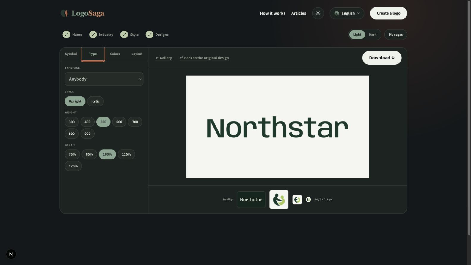
LogoSaga offers supported typefaces and weight presets. Its current editor does not provide a direct width-axis slider. Compare the available presets on your actual name; the figure illustrates the concept of font axes, not the current interface. Continue with how to make a logo, step by step.
Proof the real name before choosing
Compare two or three fonts using the actual business name, including capitals, accents, numerals and a tagline. Test characters you need, such as Č, Ł, İ, Ș or Ukrainian letters; a missing glyph can be silently replaced by another font. Confirm support in the exported file, not only the preview. A specimen reading “Logo” tells you little about a long name.
Inspect pairs such as AV, To and the actual letter pairs in your name. Kerning adjusts a pair; tracking adjusts overall spacing. Increase or reduce spacing deliberately, then compare the whole word at the size of the website header and a small avatar. For a long name, try a stacked layout or a separate compact symbol instead of squeezing the letters until unreadable.
Check the license before publishing
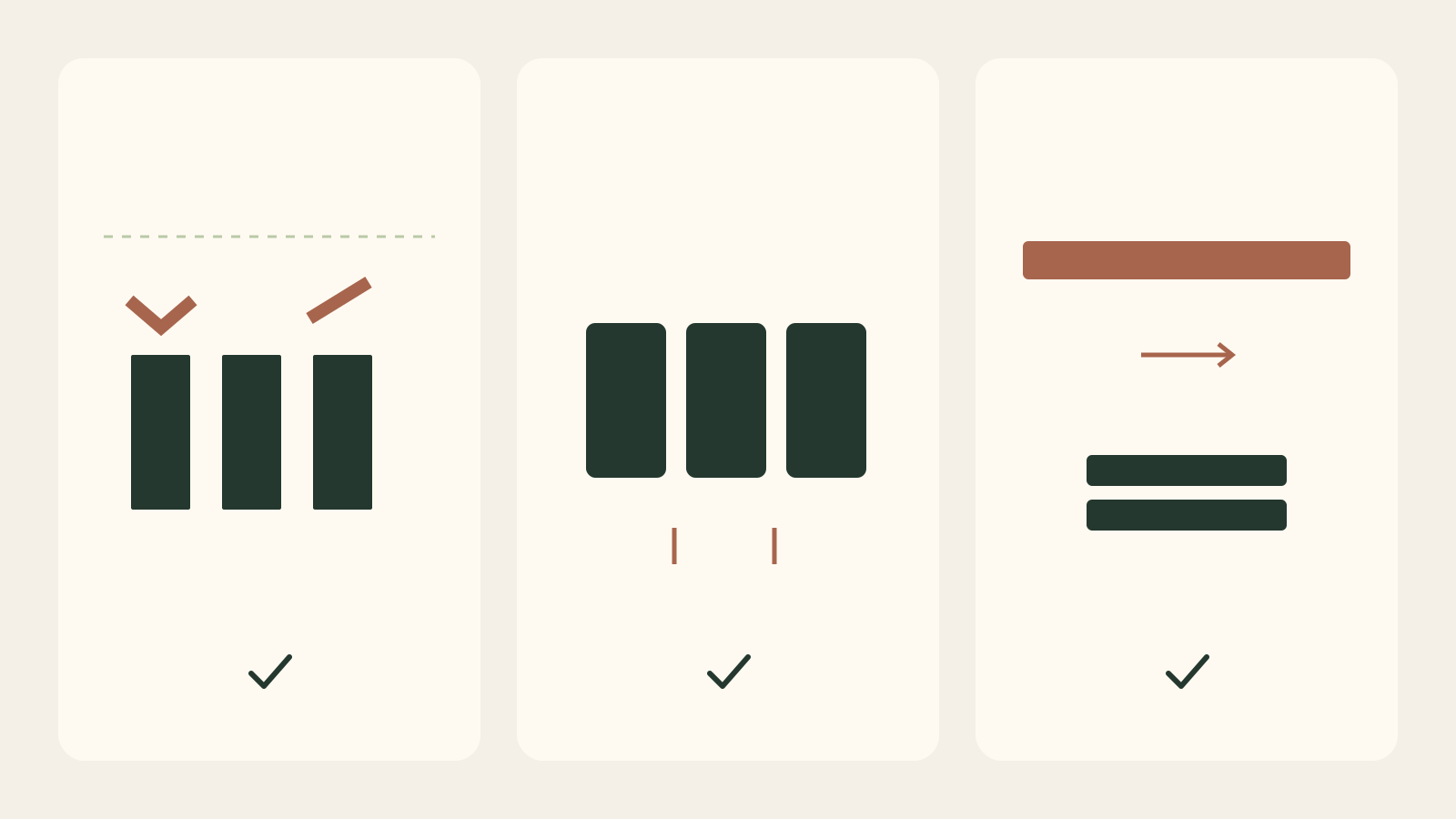
Read the license for the exact font and version: logo use, modification, distribution of font files and web embedding may have different conditions. Free download does not mean every use is allowed; converting letters to paths does not cancel a license. Keep the license and source record with the project. LogoSaga exports outlined SVG paths and includes font license information in LICENSES.txt in the brand bundle. Catalog fonts and symbols are reusable, not exclusive.
Related practical guides: Logo testing checklist: 10 checks before you launch
Try your name in different logo fonts — it's freeFrequently asked questions
What font should I use for a logo?
There is no single best logo font. Start from your brand's personality: a serif for something established and editorial, a clean sans-serif for something modern and neutral. Then confirm it stays legible at small sizes.
Serif or sans-serif for a logo?
Serifs feel traditional, authoritative, and warm; sans-serifs feel modern, clean, and stay crisp at small sizes, which suits digital-first brands. Choose the one that tells the same story as your brand.
How many fonts should a logo use?
One or two. A single typeface is cleanest; two work when they play clear, contrasting roles — for example a distinctive face for the name and a plain one for a tagline. Three or more usually looks unresolved.
Are script fonts good for logos?
Use them sparingly. Heavily scripted fonts are often hard to read, especially small, so they work best as an accent rather than the whole brand name.
How do I check accents and font licensing?
Test every character in the real name and read the license for the exact font version before using or sharing it. Keep a copy of the license; do not assume that outlining removes its conditions.
Sources
- CSS Fonts Module Level 4 — W3C
- Frequently Asked Questions — SIL Open Font License