
How many colors should a logo have? (and what they mean)
One or two colors are a useful starting point, not a universal limit. More colors can work when the brand needs them and reproduction remains practical. Test the mark in one color, on light and dark backgrounds, and at its real size. Color associations depend on context and culture.
On this page
How many colors should a logo have?
One or two colors are a useful starting point, not a universal limit. More colors can work when the brand needs them and reproduction remains practical. Test the mark in one color, on light and dark backgrounds, and at its real size. Color associations depend on context and culture.
What do logo colors mean?
Colors carry common associations that shape how a brand feels at a glance:
| Color | Common associations |
|---|---|
| Red | energy, passion, urgency, appetite |
| Orange | friendly, confident, playful, energetic |
| Yellow | optimism, warmth, attention |
| Green | growth, nature, health, sustainability |
| Blue | trust, calm, professionalism, reliability |
| Purple | luxury, creativity, sophistication |
| Black | premium, authority, sophistication |
| White | simplicity, cleanliness, space |
These are starting points, not rules — context and the shapes around a color change how it reads.
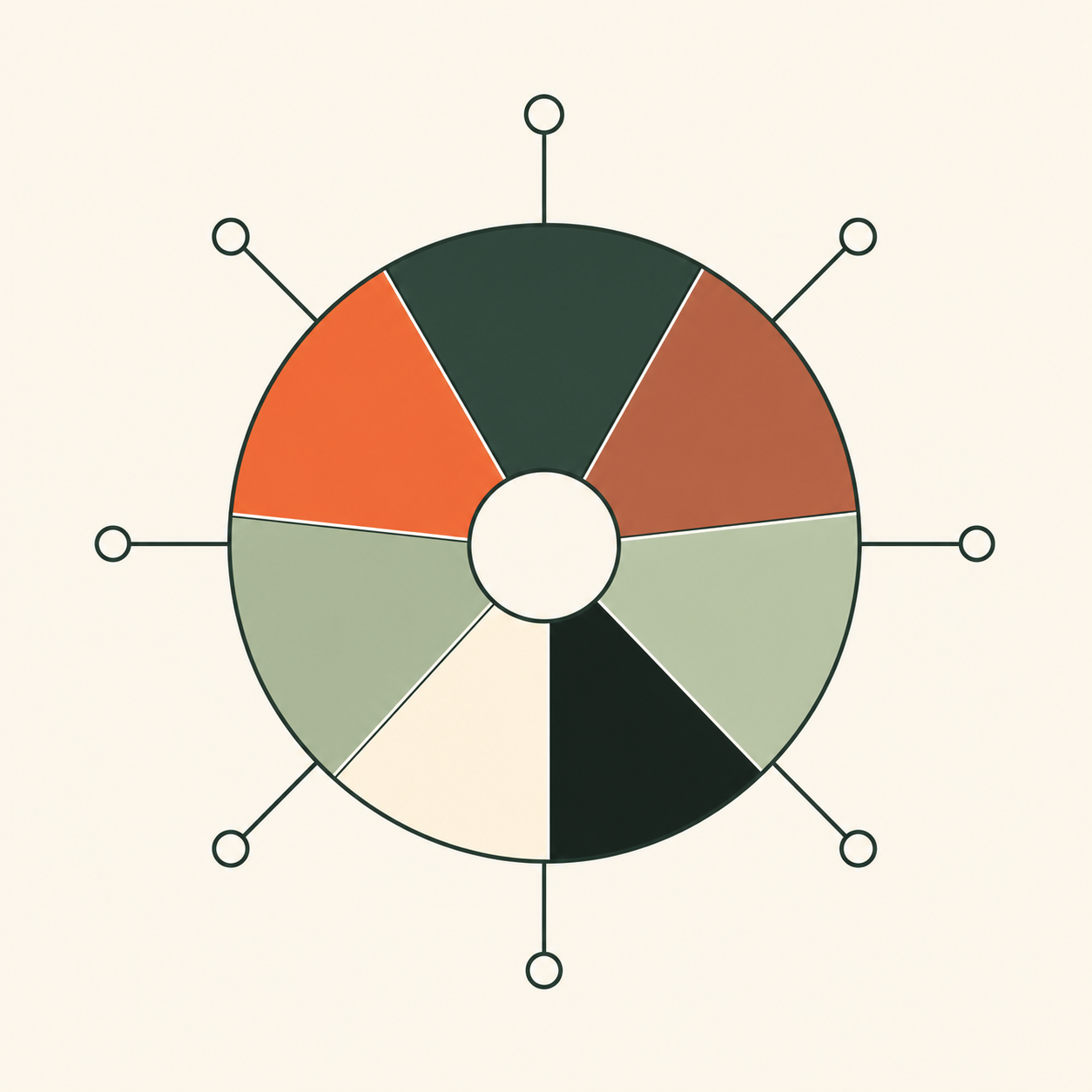
Do logo colors mean the same in every culture?
No — and for a global brand this matters. Color meaning is culture-dependent. Purple reads as royalty across much of Europe, but is associated with mourning in parts of Latin America such as Brazil. Green, red, and white also carry different connotations from region to region. If your brand will appear in several markets, check your palette against each one rather than assuming a single meaning travels.
The one-color test
Before you commit to any palette, strip the color out. A strong logo passes the one-color test: it still reads clearly in solid black on white (and white on black). If the mark falls apart without color, the design is leaning on color to do work the shapes should do.
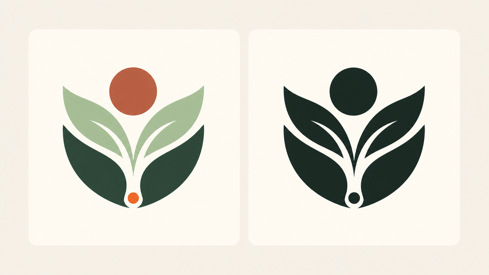
One-color versions are useful for receipts, embossing, engraving and single-ink printing. Each process has its own limits for fine lines and gaps. Test the actual size and material with the supplier; a successful screen test does not guarantee every reproduction.
How to choose your logo colors
Work from meaning outward:
Color is a decision about feeling and distinctiveness, made after the mark already works in black and white. When you are ready, see how to make a logo, step by step, and how to choose a font for your logo.
Related practical guides: Transparent logo background: clean PNG and SVG exports · Logo testing checklist: 10 checks before you launch
Explore color directions for your logo — it's freeThree example palettes to test
| Example | Main | Accent | Background |
|---|---|---|---|
| Workshop | #182A3A | #D96B2B | #FFF6E8 |
| Café | #214B3C | #B65432 | #FAF4E8 |
| Digital service | #5B45B0 | #182A3A | #FFFFFF |
These are fictional starting points, not measured psychological effects. Workshop: navy mark on cream, orange for supporting graphics. Café: green wordmark on cream, rust for packaging details. Digital service: violet symbol on white, navy for supporting text. Check every actual pairing; a palette alone does not prove accessibility. The 60–30–10 idea describes three color roles in a composition, not a requirement for a two-color logo.
Logo contrast and accessible use
WCAG 2.2 criterion 1.4.3 exempts text that is part of a logo or brand name from its minimum text-contrast requirement. This is not an exemption for ordinary headings, buttons or body text that reuse the brand colors. Essential interface graphics need separate assessment. Keep the logo readable anyway and specify an alternative for difficult backgrounds.
Frequently asked questions
How many colors should a logo have?
One or two colors are a useful starting point, not a universal limit. More colors can work when the brand needs them and reproduction remains practical. Test the mark in one color, on light and dark backgrounds, and at its real size. Color associations depend on context and culture.
What is the best color for a logo?
There is no single best color — it depends on your brand's personality and field. Choose a hue whose common associations fit the feeling you want (for example blue for trust, green for growth), and that sets you apart from competitors.
Do logo colors mean the same thing in every culture?
No. Color meaning is culture-dependent. Purple suggests royalty in much of Europe but is linked to mourning in parts of Latin America, so a global brand should check its colors in each key market.
Should a logo work in black and white?
Yes. A strong logo passes the one-color test: it still reads clearly in solid black or white. If it only works in color, the design is leaning on color to do work the shapes should do.
Sources
- Understanding Success Criterion 1.4.3: Contrast (Minimum) — W3C Web Accessibility Initiative
- Understanding Success Criterion 1.4.11: Non-text Contrast — W3C Web Accessibility Initiative