
Serif vs sans-serif logos: which to choose
Serif letters have finishing strokes; sans-serif letters do not. Neither category guarantees a traditional mood, modernity or small-size legibility. Compare actual typefaces with your name, at the intended size, and on the backgrounds you will use.
On this page
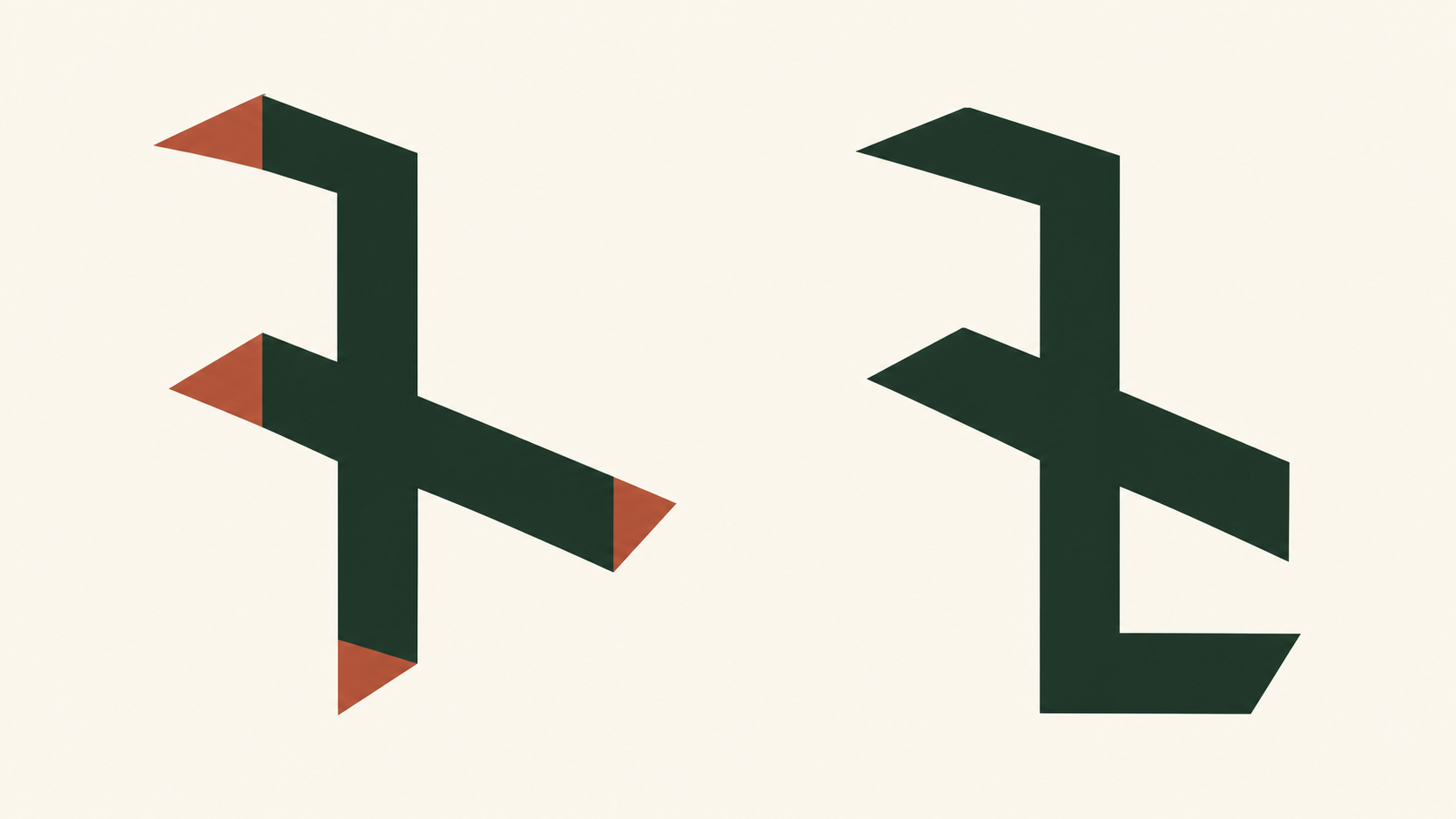
What is the difference?
Serifs are finishing strokes at the ends of letterforms. A serif typeface has them; a sans-serif typeface does not (French sans means “without”). That distinction alone does not make a font geometric, neutral or modern. Both categories contain many different constructions; assess the actual letterforms, weight and spacing.
What does a serif logo say?
A serif can suggest editorial character or craft, but its construction matters more than the label. Compare sturdy serifs with delicate high-contrast ones: they may behave very differently on a tiny label. Treat associations as a starting hypothesis to check with your audience.
What does a sans-serif logo say?
A sans-serif can suit a simple interface, but thin strokes, tight spacing and closed shapes can still fail at small sizes. Rounded, geometric and humanist designs also have different personalities. Test the actual font rather than assuming every sans-serif is neutral or clearer.
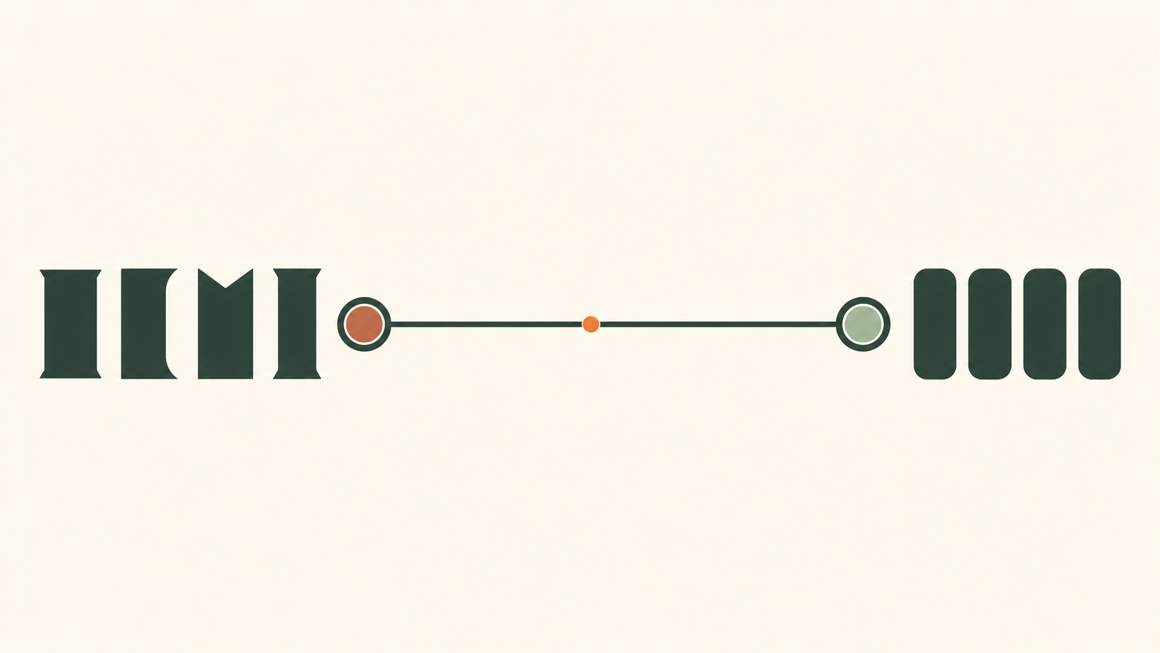
Compare the same name, not two category labels
Set the fictional name Mira in two candidates and adjust them to a comparable visual height; the same point size can look very different. Inspect the name in a narrow phone header, a square profile image and on a printed label. Check whether counters remain open, adjacent letters stay distinguishable and thin strokes survive. Test the complete real name, including accents, not a convenient sample word. If the delicate serif disappears, try a sturdier weight before rejecting all serifs. If the sans-serif feels cramped, adjust spacing or choose another face before blaming the category. Keep a screenshot or printout with your decision.
Serif vs sans-serif at a glance
| Signal | Serif | Sans-serif |
|---|---|---|
| Construction | Finishing strokes | No finishing strokes |
| Small sizes | Depends on the face, weight and spacing | Depends on the face, weight and spacing |
| Decision | Compare the real name at the intended size | Compare the real name at the intended size |
Which should you choose?
Choose the candidate that stays readable in your actual placements and fits the intended voice. Compare the logo and body-text fonts separately: a distinctive logo face does not need to be the font used for paragraphs. Recheck the pair on a real page before approving it.
How brands use both
You can pair serif and sans-serif fonts, but neither pairing nor category guarantees readability. Choose the logo and body-text fonts for their separate jobs, then check hierarchy and legibility on a real page.
how to choose a font for your logo.
Related practical guides: Logo design trends 2026: what is useful for your brand?
Try your name in serif and sans-serif — it's freeFrequently asked questions
Is a serif or sans-serif font better for a logo?
Serif letters have finishing strokes; sans-serif letters do not. Neither category guarantees a traditional mood, modernity or small-size legibility. Compare actual typefaces with your name, at the intended size, and on the backgrounds you will use.
Why do so many tech companies use sans-serif logos?
A sans-serif can suit a simple interface, but thin strokes, tight spacing and closed shapes can still fail at small sizes. Rounded, geometric and humanist designs also have different personalities. Test the actual font rather than assuming every sans-serif is neutral or clearer.
Are serif logos outdated?
A serif can suggest editorial character or craft, but its construction matters more than the label. Compare sturdy serifs with delicate high-contrast ones: they may behave very differently on a tiny label. Treat associations as a starting hypothesis to check with your audience.
Can you mix serif and sans-serif?
You can pair serif and sans-serif fonts, but neither pairing nor category guarantees readability. Choose the logo and body-text fonts for their separate jobs, then check hierarchy and legibility on a real page.
Sources
- CSS Fonts Module Level 4 — W3C