
Brand guidelines: what they are and what to include
Brand guidelines are the rulebook for how a brand looks and sounds — how to use the logo, which colors and fonts to use, and how everything fits together. Their job is consistency: they let anyone produce on-brand work without guessing. Even a small brand benefits from a simple one-page version. A filled one-page example: Luma café.
On this page
What are brand guidelines?
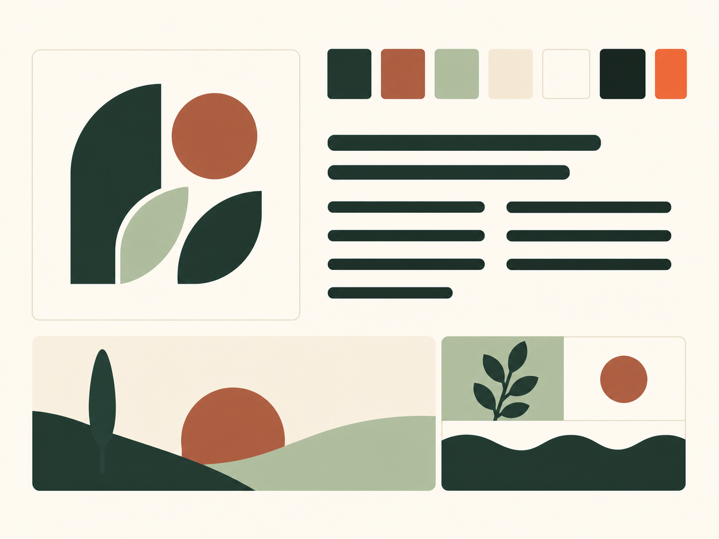
Brand guidelines (also called a brand style guide) are the document that defines how a brand's visual identity is used. They turn a set of assets — a logo, some colors, a couple of fonts — into a system with rules, so the brand looks the same whether you, a freelancer, or a print shop is making something.
Why do you need them?
The value is consistency, and consistency builds recognition and trust. Without guidelines, a logo gets stretched, colors drift, and three different fonts creep in — and the brand slowly stops looking like itself. A short rulebook can reduce these mistakes, but its value depends on people using it consistently.
What to include
You do not need a fifty-page document. A useful set covers a handful of essentials:
- Logo usage — the primary logo, its variants (secondary, mark-only, light and dark), the minimum clear space around it, and the minimum size. Determine and test minimum size and clear space for your actual logo variants and intended uses. The anatomy of a logo helps explain its construction; it does not set a universal minimum.
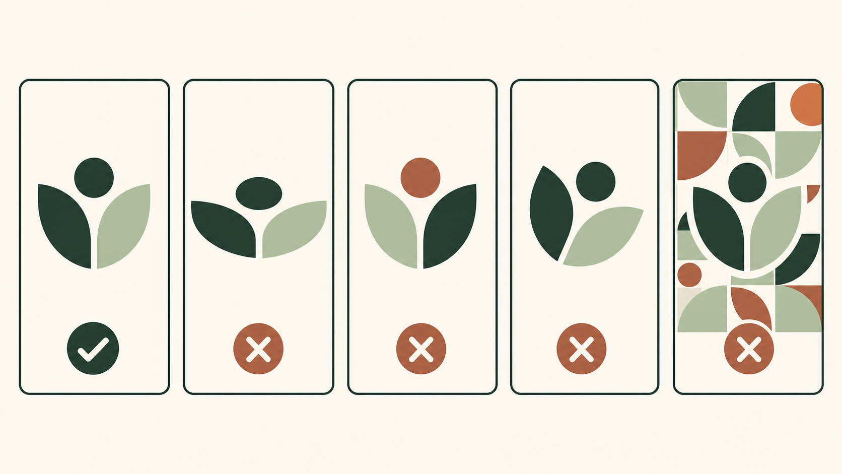
- Logo misuse — a short "do not" list: do not stretch, recolor, rotate, add effects, or place the logo on a busy background. Showing the wrong uses is often clearer than describing the right ones.
- HEX and RGB describe screen colors; CMYK needs an agreed print profile and proof. Do not promise exact visual matching merely because numbers are written down. Store approved light, dark and one-color files with these rules.
- Typography — the primary and secondary typefaces, with rules for headings, body text, and digital versus print. See choosing a font.
- Imagery — the photography or illustration style, with a few example images.
- Voice — a line or two on tone, so the writing sounds like the brand looks.
The one-page version for small brands
If a full guide feels like too much, start with a single page: your logo and its clear space, your color values, and your fonts. That alone keeps a small brand consistent as it grows, and you can expand it later. The point is not length — it is having the rules written down somewhere.
Keep them alive
Guidelines only work if people can find and use them. Keep the document somewhere shared, export the logo files alongside it, and update it when the brand evolves. A guide nobody opens is the same as no guide at all.
Start by settling the anchor — your logo — then document it. Here is how to make a logo, step by step.
A filled one-page example: Luma café
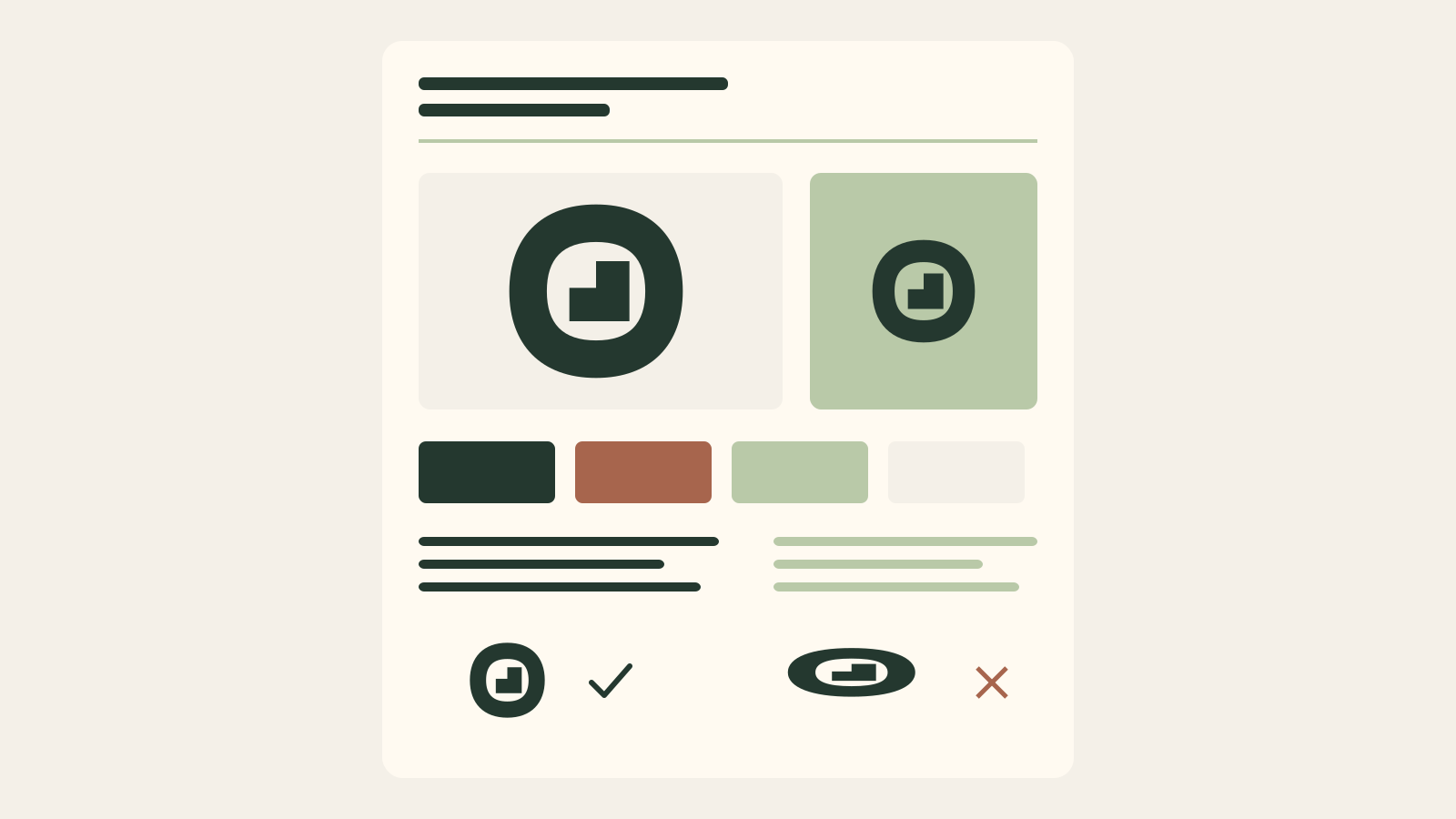
Luma is a fictional café. These rules illustrate one possible system, not universal minimum sizes or a ready-made brand. Validate the values against the actual design before adoption.
| Element | Rule |
|---|---|
| Logo | Horizontal name + symbol; symbol alone for small avatars |
| Color | Green #214B3C on cream #FAF4E8; white version on green |
| Typography | Record the exact selected font, version and license; keep a separate text font |
| Clear space | At least the height of the capital L around the complete logo |
| Minimum size | Example: full logo 120 px wide on screen or 30 mm in print, subject to a real legibility test |
| Avoid | Stretching, shadows, added outlines and a busy background |
Download and fill your own sheet
Editable HTML template · Printable A4 PDF
Edit the HTML locally, save your completed copy, or print it to PDF. The blank PDF is one A4 page for printing and handwriting. These templates document your decisions; they do not generate a new logo.
Related practical guides: Logo testing checklist: 10 checks before you launch
Create a logo to build your guidelines around — it's freeFrequently asked questions
What are brand guidelines?
Brand guidelines are a document that defines how a brand's identity is used — logo, colors, typography, imagery, and voice — with rules that keep everything consistent across every touchpoint.
What should brand guidelines include?
At minimum: logo usage and clear space, what not to do with the logo, exact color values, typography rules, imagery style, and a note on tone of voice. Larger brands add more detail.
Do small businesses need brand guidelines?
Yes, but they can be short. A single page covering the logo, colors, and fonts is enough to keep a small brand consistent as different people and tools create for it.
What is the difference between brand guidelines and a style guide?
They usually mean the same thing. 'Brand guidelines' or 'brand style guide' both describe the document that governs how a brand's visual and verbal identity is applied.
Download and fill your own sheet?
Edit the HTML locally, save your completed copy, or print it to PDF. The blank PDF is one A4 page for printing and handwriting. These templates document your decisions; they do not generate a new logo.
Sources
- Mozilla design: identity guidelines — Mozilla
- SIL Open Font License FAQ — SIL Open Font License
- ICC Frequently asked questions: color management and profiles — International Color Consortium