Geometric logos: what they are and how to design one
A geometric logo uses circles, lines, squares or related forms. A grid can help consistency but is a guide, not proof of a good design. Shape associations depend on context; test distinctiveness, optical balance and real-size reproduction before choosing the mark.
On this page
What is a geometric logo?
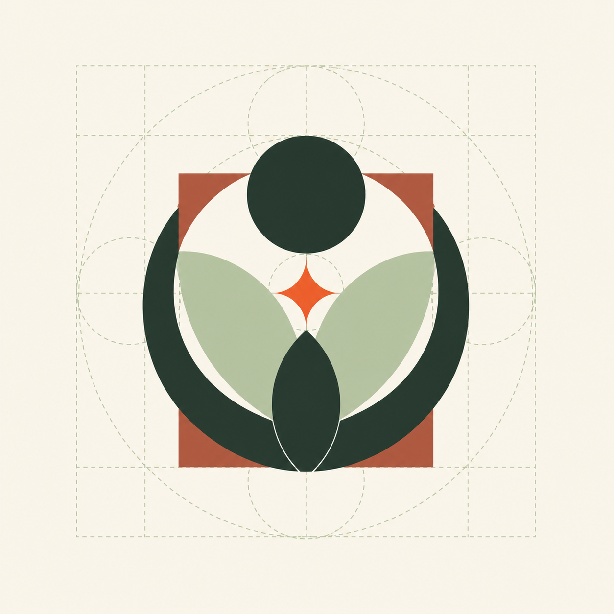
Geometry is a style, not a separate logo type: a symbol, monogram or combined name can all use it. Repeated proportions can organize a design, while optical adjustments may improve how it looks. Perfect mathematical alignment is not always perfect visual alignment.
Why geometric logos work
Simple geometry can be convenient for interfaces and one-color production, but neither readability nor modernity is automatic. Thin strokes, crowded intersections and generic shapes can fail. Use the grid to explore options, then judge the mark without visible construction guides.
What basic shapes signal
The building blocks are not neutral — they carry associations you can use on purpose:
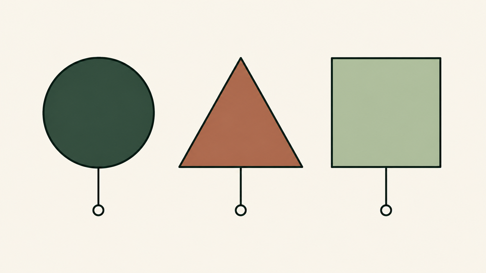
- Circle — unity, community, continuity, wholeness.
- Triangle — direction, energy, ambition, movement.
- Square and rectangle — stability, order, trust, structure.
- Lines and grids — precision, technology, connection.
As with color, these are starting points; context changes how a shape reads.
How to design a geometric logo
- Start from a grid. Lay down guides — a square grid, circles, and diagonals — and build the mark on them so every part relates.
- Use a small set of shapes. Restraint is what makes geometry feel intentional rather than busy.
- Exploit negative space. The gaps between shapes can form a second meaning without adding parts.
- Keep proportions consistent — equal spacing, aligned edges, matching curves.
- Limit color and test small. One or two colors, and confirm it still reads at favicon size.
When geometric isn't the right style
Geometry can feel cold. Brands built on warmth, craft, or personality may be better served by a vintage or mascot approach. Match the style to the story. When you are ready, here is how to make a logo, step by step.
Worked example: Rivo, a bicycle repair workshop
Rivo is a fictional everyday-bike workshop, not a racing-equipment seller. The brief: an approachable name on sign, invoices and van, plus compact profile image. Begin with those uses, not a circle’s supposed universal meaning. An aggressive arrow could imply speed that is irrelevant to the service; a literal detailed bicycle may be too intricate for the profile image.
Sketch three candidates on the same grid: two offset circles, a triangle combined with an R and a rounded square containing a simple wheel-like gap. Compare the silhouette before adding color. Reject the triangle if it resembles a play button. Reject the circles if they resemble a nearby workshop’s mark. Provisionally keep the rounded square for compact boundary and identifiable opening, not because squares scientifically create trust.
Check corner curves, gap width and apparent center. A shape can be mathematically centered and still look uneven because one side contains more dark area. Move or resize the internal element slightly, compare with the untouched version without the grid. Keep consistent geometry where it helps, but do not force a golden-ratio construction or a tiny decorative detail merely to justify the design. Pair the symbol with the readable name Rivo for first-time customers.
Test black on white, white on dark and the chosen color on the intended van background. View the invoice normally, the shop sign from a realistic distance and the avatar at 32 px. If the wheel gap closes, enlarge it or simplify the inner shape. If the mark reads as a generic app icon, revisit the concept rather than adding more lines. Record the selected lockups and minimum tested size; ask the sign maker to confirm production limits before ordering.
Ask the supplier whether chosen gaps and corners reproduce reliably in the actual material. Keep the approved output for later orders.
Related practical guides: Logo design trends 2026: what is useful for your brand? · Logo testing checklist: 10 checks before you launch
Try a geometric direction for your logo — it's freeFrequently asked questions
What is a geometric logo?
Geometry is a style, not a separate logo type: a symbol, monogram or combined name can all use it. Repeated proportions can organize a design, while optical adjustments may improve how it looks. Perfect mathematical alignment is not always perfect visual alignment.
What do geometric shapes mean in a logo?
Broadly: circles suggest unity, community, and continuity; triangles suggest direction, energy, and ambition; squares and rectangles suggest stability, order, and trust. Context shifts these.
Why are geometric logos so popular in tech?
Simple geometry can be convenient for interfaces and one-color production, but neither readability nor modernity is automatic. Thin strokes, crowded intersections and generic shapes can fail. Use the grid to explore options, then judge the mark without visible construction guides.
How do you make a geometric logo?
Build it from a grid and a small set of shapes, keep proportions consistent, use negative space deliberately, limit the palette, and test that it still reads at small sizes.