
What is a minimalist logo? (and how to make one)
A minimalist logo reduces detail to a few deliberate elements. This can make reproduction easier, but simplicity alone does not guarantee recognition, legibility or longevity. Keep a distinctive idea, test the actual sizes and backgrounds, and choose the style for the brand rather than because it is fashionable.
On this page

What is a minimalist logo?
A minimalist logo applies the "less is more" principle: it removes every element that is not essential, leaving clean lines, basic shapes, and a small palette. It is less a specific look than a discipline — keep taking things away until removing one more would break the idea.
Why do minimalist logos work?
Fewer elements can simplify reproduction and help hierarchy. These are possible benefits, not automatic results: a generic circle may be hard to distinguish, a thin wordmark may fail when reduced, and a fashionable typeface may date quickly. Compare real applications before deciding that reduction improves the design.
Minimalism is not oversimplification
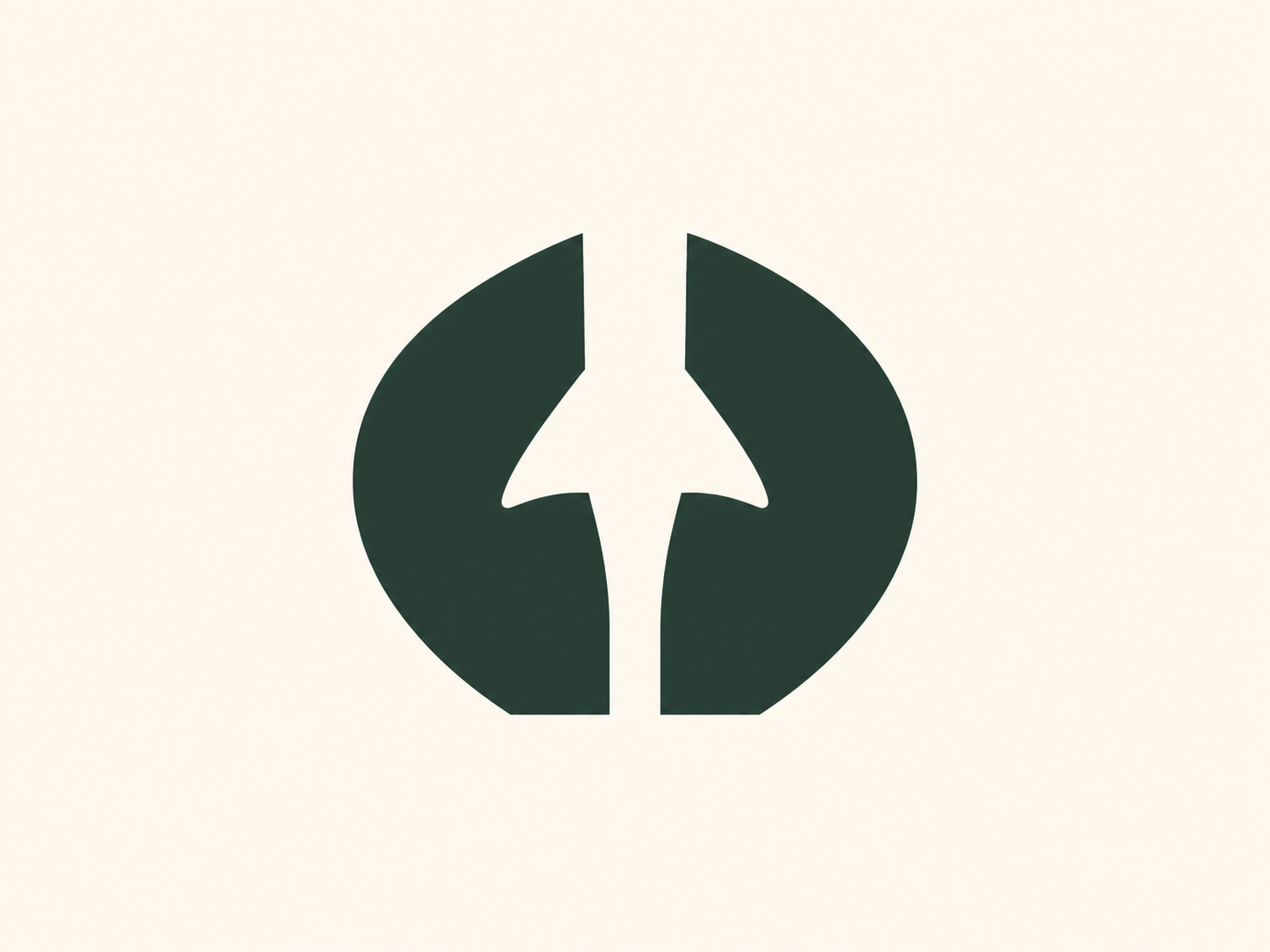
Here is the trap: a logo can be simple and still say nothing. Reduction only works if what remains is distinctive. The strongest minimal logos carry a single clever idea — often using negative space, where the gaps form a second meaning. The best-known example is the arrow hidden between the E and X of the FedEx wordmark: nothing is added, yet the mark says "forward."
How to make a minimalist logo
- Find the one idea. Decide what single thing the mark should say before you draw.
- Reduce relentlessly. Strip detail, thin ornament, and extra shapes until only the essential remains.
- Limit color. One or two colors — see how many colors a logo should have.
- Use simple, confident shapes and generous space; consider negative space to add meaning without adding parts.
- Test it small and in one color. If it survives a favicon and plain black, the reduction worked.
When minimalism isn't the right style
Choose minimalism when the brief benefits from restrained forms and the result stays distinctive. A character or detailed emblem may serve another brief better; neither style is universally superior. the seven types of logos.
A quick history: less, over time
Minimalism is also where many brands end up as they mature. Apple's 1976 logo was a detailed engraving of Isaac Newton under a tree, complete with a border and a quote; the company soon reduced it to the single, instantly recognizable apple silhouette. That arc — from ornate to essential — is the story of minimalism in one brand.
Worked example: Nora, a small bookkeeping service
Nora is fictional: a solo bookkeeping service for independent shops. Its first uses are an invoice header, a website and a small profile image. The owner wants a calm, dependable identity without looking like a bank. Write those requirements before deciding how little detail the logo should contain. A plain name can be appropriate here, but a generic symbol does not automatically make it more professional.
Compare three directions: a thin N monogram, a readable wordmark and a wordmark with a small geometric symbol. Place each on the same invoice and in the same website header. Prefer the wordmark for the main use because the service is new and customers need to learn the name. Keep the monogram as a candidate for the avatar, not a compulsory replacement for the name. This is a decision for this brief, not a rule for every small firm.
Remove the decorative underline and secondary slogan first. Keep any small letter detail only if it helps distinguish Nora without making the name ambiguous. Check actual letter pairs and the intended language’s accents. Compare black on white, white on a dark background and the chosen brand color; do not assume one version works on every surface. A negative-space feature is useful only if the basic mark still reads when that feature is unnoticed.
Finally view the invoice at normal reading size, the header on a phone and the avatar at 32 px. If the thin N loses its diagonal or resembles another letter, increase its weight or keep the name version; do not shrink the complete wordmark into the avatar. Ask prospective clients what they read before explaining the design. Record the chosen files, spacing and minimum tested size in the guidelines.
Choose the files suppliers can actually open and reproduce.
Related practical guides: Logo testing checklist: 10 checks before you launch · Logo design trends 2026: what is useful for your brand?
Design a clean, minimal logo — it's freeFrequently asked questions
What is a minimalist logo?
A minimalist logo is a mark reduced to its essential elements — simple shapes, a limited palette, and no unnecessary detail — following the 'less is more' philosophy for maximum clarity and recognition.
Why are minimalist logos so popular?
Fewer elements can simplify reproduction and help hierarchy. These are possible benefits, not automatic results: a generic circle may be hard to distinguish, a thin wordmark may fail when reduced, and a fashionable typeface may date quickly. Compare real applications before deciding that reduction improves the design.
Are minimalist logos better?
Choose minimalism when the brief benefits from restrained forms and the result stays distinctive. A character or detailed emblem may serve another brief better; neither style is universally superior.
How many colors should a minimalist logo use?
Usually one or two. A limited palette keeps the mark clean and easy to reproduce; the point of minimalism is to remove, not add.
Sources
- The Apple Logo Story — Rob Janoff Agency
- IBM Logo and Brand Guidelines: optical versions — IBM