
Vintage and retro logos: what they are and how to make one
A vintage or retro logo borrows the look of an earlier era — badges and emblems, classic serifs and scripts, muted warm colors, and a hand-crafted feel. It works because those cues read as heritage, authenticity, and craft. The main risk is detail: a vintage mark must be simplified enough to still read at small sizes.
On this page

What is a vintage or retro logo?
A vintage logo (often used interchangeably with retro) deliberately evokes design from a past era. It is a style, not a logo type — you can make a wordmark, an emblem, or a combination mark look vintage. The look comes from a recognizable set of cues.
The ingredients of a vintage look
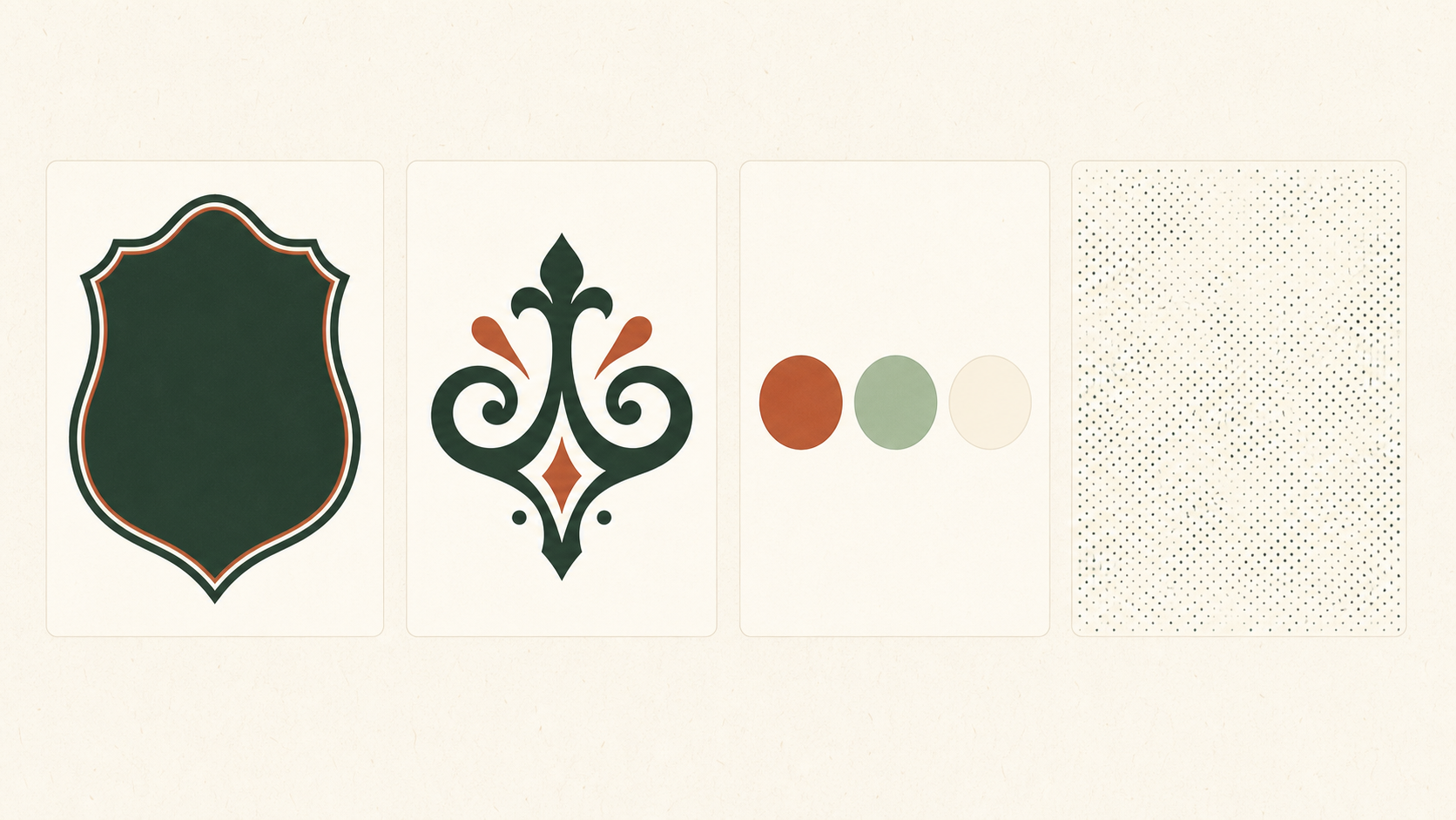
- Badges and emblems. Circular crests, banners, and seals feel established and official — which is why emblems are the classic vintage form. See the seven types of logos.
- Classic type. Serifs, slab serifs, and script faces read as period-appropriate; see choosing a font.
- Muted, warm color. Aged, desaturated palettes — cream, rust, forest, navy — feel older than bright, saturated ones.
- Subtle texture. A light worn or printed texture suggests age and craft — used sparingly.
Why vintage logos work
Vintage cues carry meaning: they signal heritage, authenticity, and hand-made quality. In a market full of flat, minimal, sans-serif logos, a warm retro mark stands out and feels human. For the right brand, that contrast is an advantage.
Which brands should use one?
Vintage styles suit businesses whose value is craft, tradition, or authenticity — coffee roasters, breweries and distilleries, barbershops, bakeries, workshops, outdoor and heritage brands. They fit less well for brands that need to feel cutting-edge or purely digital, where a minimalist approach reads better.
How to make a vintage logo (without it looking cheap)
- Pick a period and a form. Decide which era you are borrowing from, and whether it is a badge, an emblem, or a classic wordmark.
- Choose period-appropriate type — a strong serif, slab, or restrained script.
- Use a muted, warm palette — one or two colors, aged rather than bright.
- Add texture sparingly, if at all.
- Simplify for small sizes. This is the trap: intricate crests collapse at favicon size. Design a simplified version and run the one-color test.
The risk: detail that does not scale
Vintage logos fail when they pile on flourishes and fine texture that disappear when shrunk or printed in one color. Restraint is what separates a convincing heritage mark from a cluttered one. When you are ready, here is how to make a logo, step by step.
How does a retro direction work in real applications?
These fictional briefs show how to keep atmosphere without inventing history. A vintage style does not prove that a business is old, authentic or better made. In Pentagram’s Hiut project, documented in June 2026, the identity draws on the maker’s actual place and people. Use that as a lesson in relevance, rather than copying the appearance.
Morrow Roasters, newly founded, chooses a strong slab-serif name and a simple sun. On a coffee bag there is room for an outer badge; in an avatar, use the sun alone. A fake “Est. 1978” would misstate the brief. Remove it, and put the real story in packaging copy.
Alder Repair has a documented workshop history. Its street sign can use a restrained period-inspired wordmark, but a ring of tiny service names would disappear at viewing distance. Move services to separate sign text and keep the brand name dominant. Historical facts and visual nostalgia are separate decisions.
| Application | Likely failure | Practical correction |
|---|---|---|
| Coffee bag | Distressed holes fill in during printing | Keep a clean one-color logo; texture the surrounding artwork |
| Small avatar | Badge border, year and slogan compete | Use the approved core symbol with crop-safe space |
| Workshop sign | Flourishes interrupt the name | Simplify letter endings and test a full-size viewing proof |
Keep both approved variants in the handoff. Test the actual smallest destination; a beautiful large badge cannot certify its miniature counterpart.
Related practical guides: Logo design trends 2026: what is useful for your brand? · Logo testing checklist: 10 checks before you launch
Try a vintage direction for your logo — it's freeFrequently asked questions
What is a vintage logo?
A vintage or retro logo uses visual cues from an earlier era — badge or emblem shapes, classic serif or script type, muted warm colors, and subtle texture — to signal heritage, authenticity, and craftsmanship.
What businesses should use a vintage logo?
Vintage styles suit craft and artisanal brands — coffee roasters, breweries, barbershops, bakeries, workshops — and any business whose value is heritage, tradition, or hand-made quality.
Are vintage logos still popular?
Yes. Retro and hand-crafted styles remain popular precisely because they feel warm and authentic in contrast to the wave of flat, minimal, sans-serif logos.
What makes a vintage logo look cheap?
Overdoing it — too many flourishes, heavy fake texture, and fine detail that turns to mush when shrunk. A convincing vintage logo is restrained and still legible small.
Sources
- Hiut — Pentagram